The project is implemented by RIO Hanoi Team
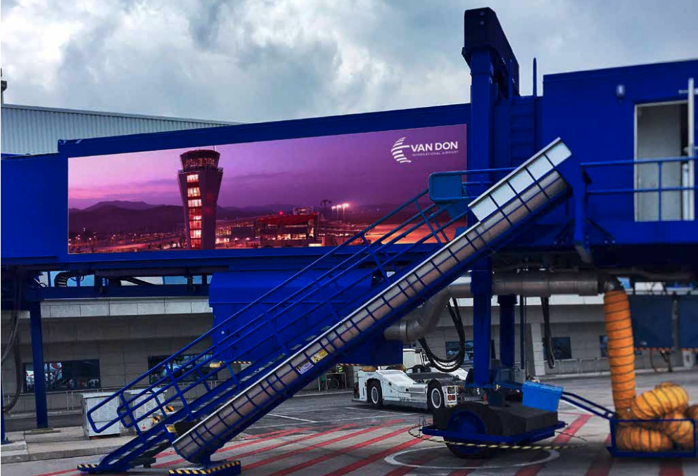
As the first private and international airport in Vietnam, Van Don International Airport expresses the desire to take off and fly far away, promoting the development of tourism and the local economy as well as being a bridge between Vietnam and Vietnam. and the world.
The image of the sun is represented by parallel layered architecture in globe shapes. In addition, we also develop parallel meanings of the image of taking off and flying by integrating the local elements of Van Don - the image of a sail in Ha Long Bay soaring with the sun.
Vandon Airport Branding
Client
Sun Group
Sun Group
Designer
Duc Mau
Tuan La
Tuan C
Duc Mau
Tuan La
Tuan C
Account
Trong Tran
Trong Tran
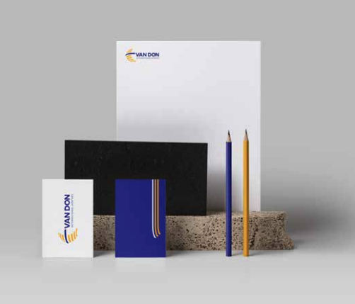
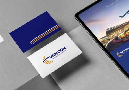

Characteristic graphic elements are exploited from 3 curves that are similar to the logo. The main colors are yellow and blue, in which blue accounts for a large proportion, creating a prominent highlight on the identity color. The images of some publications in the brand identity system of Van Don International Airport are aimed at simple, sophisticated and easy-to-apply elements.
Check out our other projects